
All About Portra: This Asheville Photographer’s Favorite Film
A beautiful example of Portra’s intentionally flat tonality.
I’ve been back in the film game for about five years now, and I’m really starting to understand the subtle nuances between films and even developers! I’ve been favoring Kodak Portra lately so I thought I would do a quick but deep dive into this deliriously dreamy film. I am a family photographer in Asheville, North Carolina. I shoot digital, film, and hybrid digital-film sessions, but something about summertime and all the blues and hues make me favor film. If you’re looking for a family photographer in Western North Carolina, click the link below to book your session. If you live elsewhere, check out my Full Day in the Life sessions! I travel across the country to shoot them (as well as Europe and Ireland!) Oh, and if you’re a fellow photographer, check out Ball Photo Supply for all your film and camera needs. It’s where I buy and process all of my film.
Portra is a favorite among professional photographers for good reason: it strikes an ideal balance of color accuracy, flattering skin tones, subtle contrast, and forgiving exposure latitude. If you’re considering hiring a photographer who shoots film—or a pro who mixes film into their workflow—here’s what makes Portra special, why its tonality reads as “flat,” and why choosing someone who uses it matters for the look and longevity of your images.
Portra (commonly Portra 160, 400, and 800) is formulated to reproduce skin tones with exceptional fidelity and warmth. The palette leans toward gentle, natural hues rather than punchy saturation, which makes it versatile for portraiture, weddings, and lifestyle work. The grain structure is fine and pleasing, especially in the lower ISO versions, giving images a tactile, cinematic quality without the harshness of heavy digital sharpening or high-ISO noise.
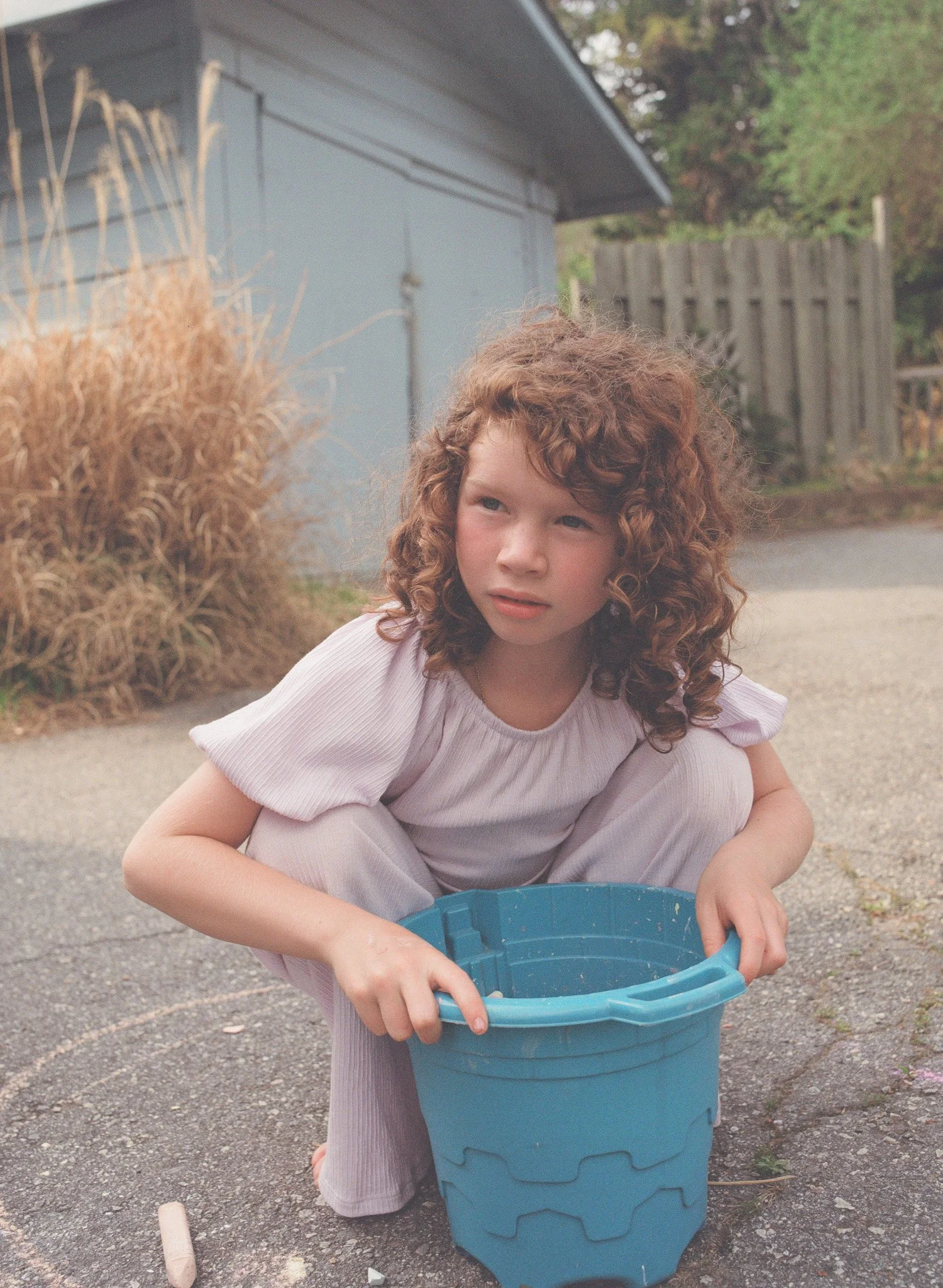
This image was made with a medium format Pentax 645 camera with Portra 160 film.
Why professionals prefer Portra:
Pros rely on consistency. Portra’s rendering of different skin tones is reliable across lighting situations, reducing retouch time and ensuring flattering results for clients.
Wide dynamic range: Portra retains detail in both highlights and shadows, which is invaluable in mixed light situations—backlit ceremonies, window-lit interiors, or sunlit portraits.
Post-processing flexibility: Its subdued contrast and restrained color saturation make Portra a forgiving base for scans and digital edits. Photographers can push color grading in any direction without battling extreme color casts.
Emotional tone: The film’s warm, understated aesthetic communicates intimacy and timelessness—qualities many clients want preserved in portraits and family work.
Archival reliability: Film negatives, when stored correctly, offer a physical original that can be rescanned or reprinted with different looks over decades.
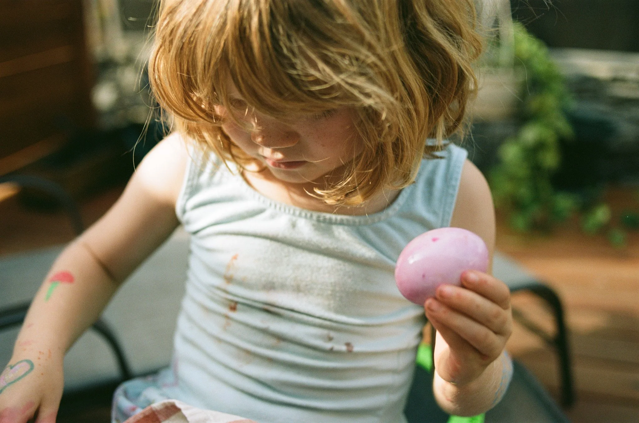
Freckles and eyelashes are rendered in such soft, lovely detail with a medium format camera and Portra film.
Why the tonality feels flat Portra’s “flat” tonality is intentional. Compared to many digital JPEGs or high-contrast film stocks, Portra has lower in-camera contrast and softer highlight roll-off. This subdued rendering preserves more detail through the tonal range: highlights don’t clip abruptly and shadows hold texture. The result reads as “flat” when viewed straight from a scanner or unprocessed scan because the film prioritizes information retention over punch. That flatness is an advantage—editors and printers prefer a file with more captured detail because it allows controlled contrast and color adjustments later without degrading image quality.
Choosing a photographer who uses Portra Selecting a photographer who knows how to use Portra means hiring someone who understands subtlety: how to expose to protect skin highlights, how to shape natural light, and how to scan and grade film for a final product that respects the film’s character. They’ll likely deliver images with a cohesive, timeless feel that translates beautifully to prints and albums. For clients wanting emotional, flattering, and long-lasting portraits, a photographer experienced with Portra will offer an aesthetic many find superior to the hyper-processed look of modern digital imagery.
Bottom line Kodak Portra isn’t just a film stock; it’s a tool that helps photographers like me craft a mood—soft, warm, authentic—that endures. Its flat tonality is a strength, preserving detail and tonality for considered post-production. If you value flattering skin tones, subtle color, and archival quality, choosing a photographer who shoots Portra is a smart way to ensure your images age gracefully and feel genuinely timeless. If you’re ready to see your family in film- reach out.
xo
Melina